Ecommerce is predicted to account for 17% of all U.S. retail sales by 2022. As ecommerce grows, so does competition, making it hard to differentiate your website from everyone else’s.
It isn’t enough to have a one-of-a-kind product: to attract your ideal audience — and more importantly, to turn that audience into passionate brand ambassadors — you need a one-of-a-kind website.
A sleek and captivating Shopify website can attract a large audience and even act as your start-to-finish marketing pitch.
But you need to know what makes one Shopify website better than the rest. Here, we’ve curated a list of 16 best of the best Shopify stores to inspire your own.
Whether you’re new to ecommerce and about to design your first website, or an ecommerce veteran considering a redesign to outshine your competitors in 2018, this list offers plenty of creative ideas.
1. UgMonk
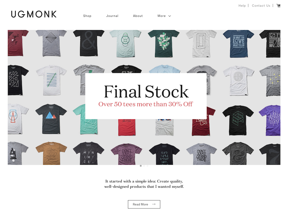
Jeff Sheldon starts the “About” section on his UgMonk website with a simple question: “Why was it so difficult to find fresh, high-quality, unique items in a modern aesthetic?” His Shopify site is simple and fresh, and exhibits UgMonk’s clothing, workplace items, bags, and prints in the same modern aesthetic style he sought while designing his unique products.
2. Pipcorn
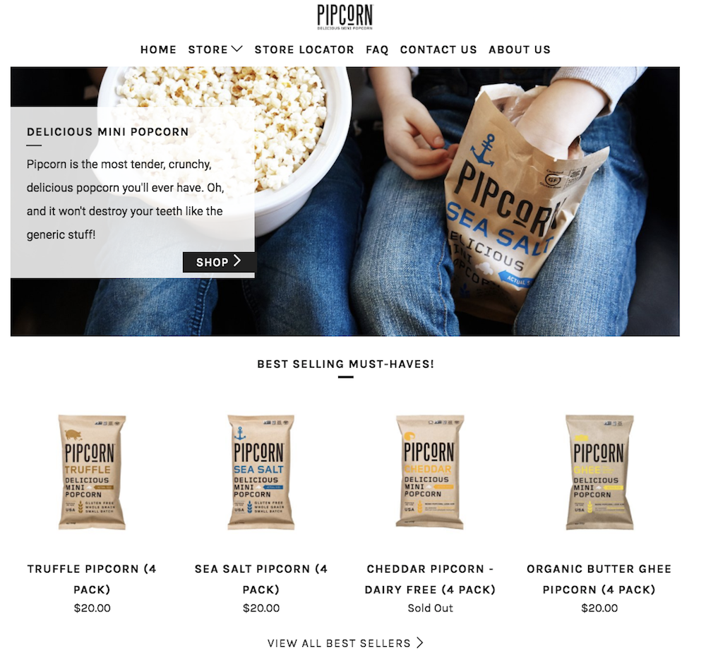
When you think about popcorn, I’m betting the first concern that comes to mind isn’t “is it healthy?” Pipcorn knows this, so their homepage features a simple slogan: “Most tender, crunchy, delicious popcorn … and it won’t destroy your teeth like the ‘generic’ stuff.” The best websites know their target audience’s primary concerns (in this case, the taste of popcorn and the kernels in teeth), and sell them on those solutions upfront. If you look on their “About Us” page, you’ll find Pipcorn’s products are also non-GMO, vegan, gluten free, and whole grain. Even though this could have easily been incorporated into their slogan, they chose to exclude it in favor of tackling our bigger concern: Does it taste good?
3. Taylor Stitch
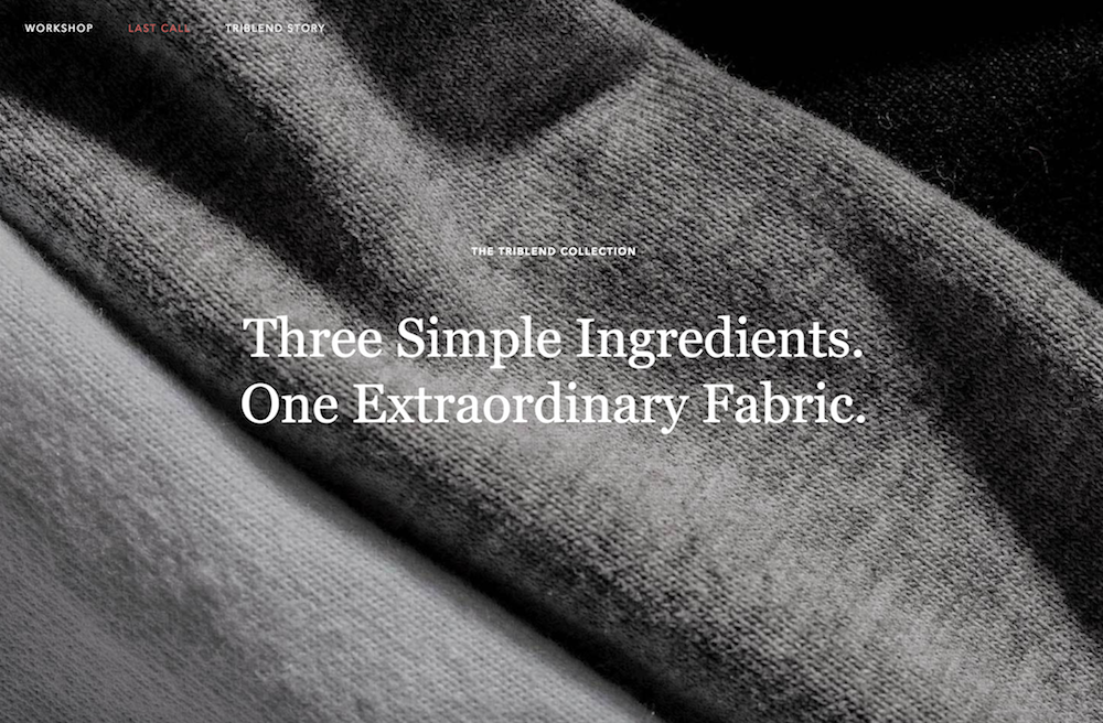
The inner child in me loves Taylor Stitch’s website because of the creative alternatives displayed when you hover over a product: a jacket, for instance, flips to an image of a model posing with the jacket on a motorcycle. The Taylor Stitch website does something else really cool, too — it almost immediately calls more attention to its message than its products, with “Three Simple Ingredients” written across most of the images you see on the homepage. Taylor Stitch doesn’t just make high-quality clothing. It also aims to reduce waste and help the environment by creating clothing with recycled or 100% natural products. On their website, you can’t miss their environmental efforts, and I’m betting this is a differentiating factor for most buyers when they come across the site.
4. Happiness Abscissa
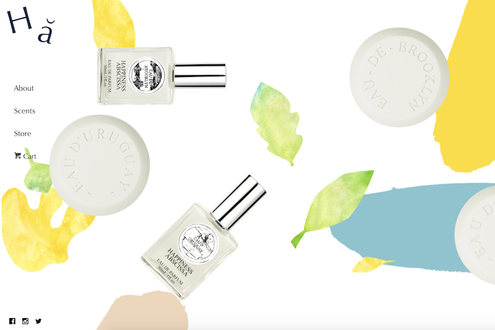
Many of the websites I mention on this list have clean, straight lines. Happiness Abscissa is unique. It shows a playful side by displaying a layout with bright abstract images, and even products hanging from different angles. Their logo, a crooked Ha, draws in the viewer’s attention, and then they use Ha in a sentence without defining the word, further stimulating viewers’ curiosity. You get the sense they don’t take themselves too seriously, affording the viewer a cheerful and fun experience.
5. Skinny Teatox
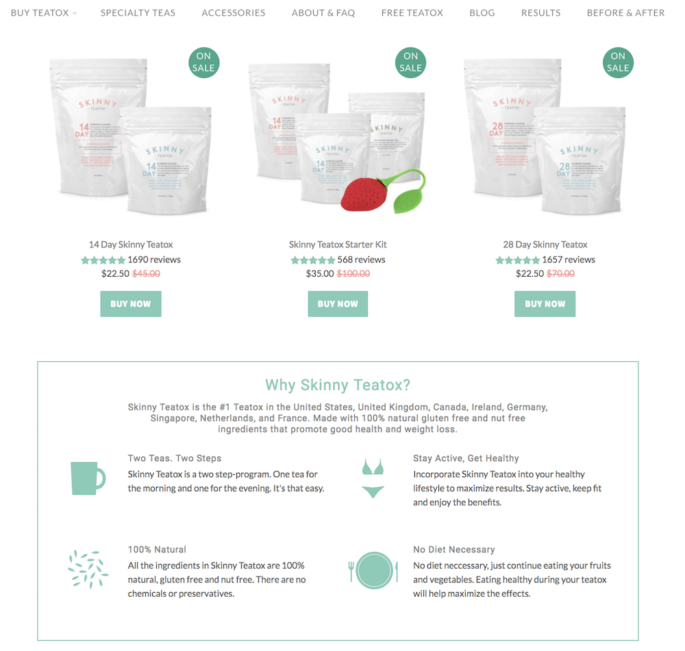
I myself was tempted to purchase the Teatox product when I checked out this site (in my defense, they were having a one-day flash sale I did not want to miss). The Skinny Teatox homepage immediately confronts your biggest concerns (“Is it natural? Yes. Will it work? Yes.”), and uses pastel colors and cute icons of bikinis and mugs to convey a fresh vibe. As I’ve noticed with a few other Shopify websites, Skinny Teatox places its products on the homepage with an easy “buy now” call-to-action. For a company that isn’t too complex to figure out (“All Natural Detox Weight Loss Tea” is written beside the company name in search engines), I think it makes sense to offer the viewers what they want upfront.
6. HELM Boots
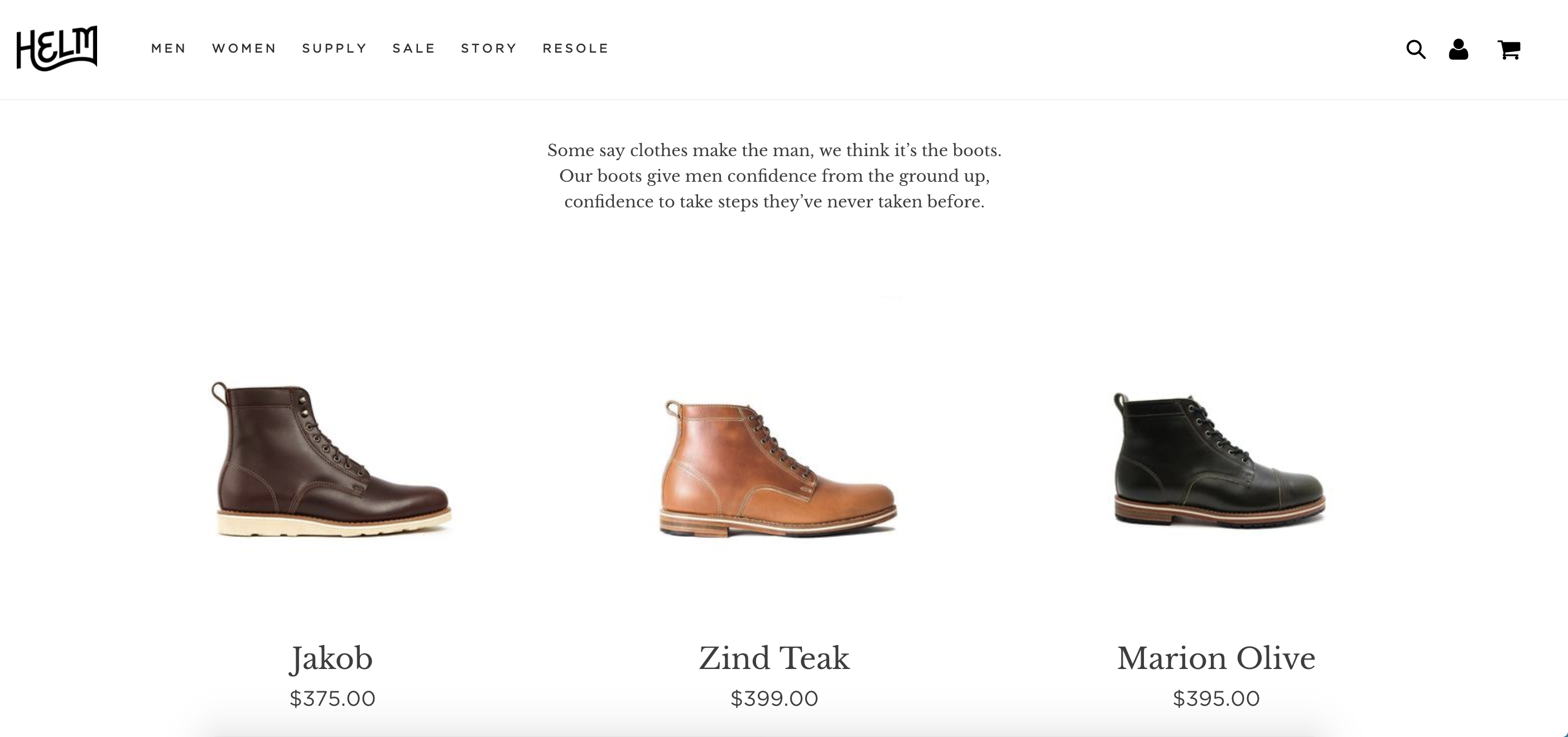
“Our boots give men confidence from the ground up, confidence to take steps they’ve never taken before.” Immediately, HELM incentivizes viewers through emotion: I might just be a guy looking to buy some boots, but yes, I’d definitely also like some confidence and bravery while I’m at it. The website looks elegant, and you can find everything from the homepage, which is designed to convert viewers at various stages of the buyer’s journey and assuage doubts as you scroll.
7. BioLite
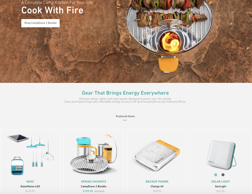
I might be a sucker for the little details, but the product images on BioLite’s website are enough to make me want to buy something (they look 3-D and illuminated, and some even look wet from rain!). Since BioLite’s major selling point is its humanitarian impact (the products bring affordable energy access to places in India and Africa), the first thing on the homepage is their slogan, “Gear That Brings Energy Everywhere,” which will appeal to their target audience. The navigation bar at the top also has a clever twist: beside each product title, there are little black-and-white cartoon drawings of the product.
8. Pop Chart Lab
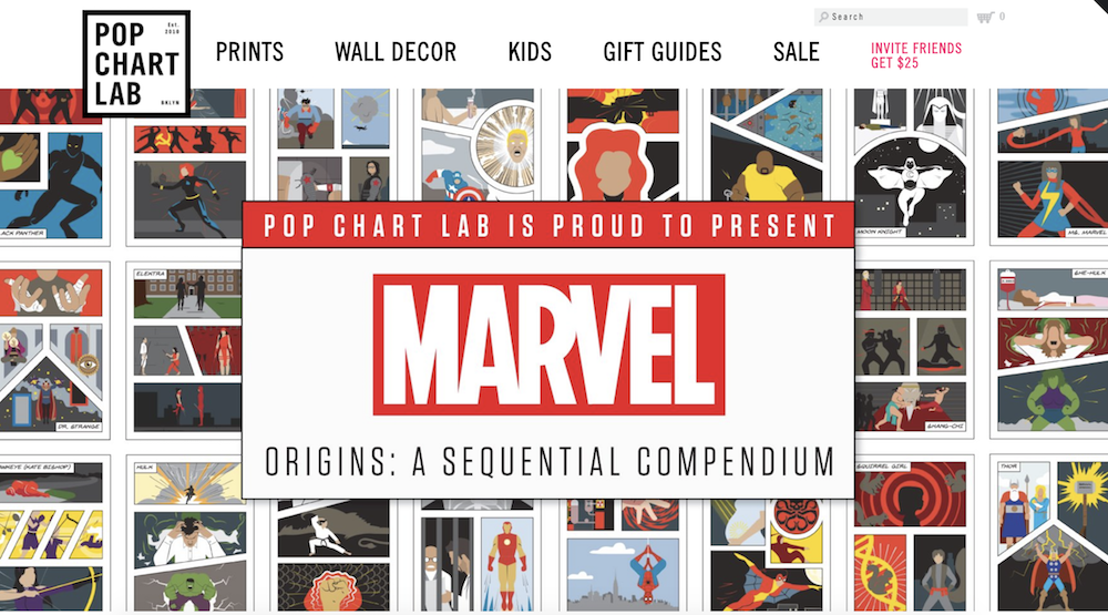
This site looks like one of the vintage and trendy prints they sell. It’s also organized in different categories depending on a viewer’s browsing preference. First, they have a scroll-down navigation with sub-categories ranging from, “NYC” to “Kids” to “Hip Hop” to “Wine.” They also have a carousel with some of their top prints on display. Below the carousel, they offer “wholesale,” “gift guides,” and “scratch-off” collections, for viewers who are having a difficult time discerning what they want. The shop manages to appear simple, despite its vast array of different print products, which is no easy feat.
9. Luca and Danni
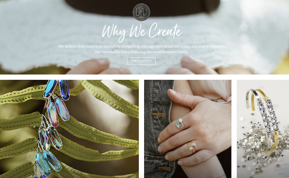
There’s something addictive about an ecommerce store that changes as you scroll. Luca and Danni’s page is highly interactive: as you scroll, some images get bigger and others get smaller, boxes of bracelets open up within images, and some images follow you down the page. It can be tricky to offer so much movement on a page while remaining coherent, but somehow, Luca and Danni accomplish this. There’s also a very zen vibe to the whole layout, with images of palm trees and cactuses, and calls-to-action with language like “brighter days: shop soil to sky,” and “find what speaks to you.”
10. Harris Farm Markets
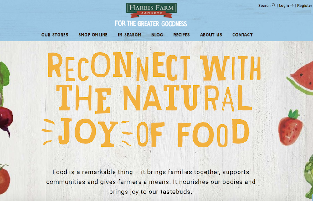
This is a family-owned company, something you can’t miss from the homepage. It’s casual and playful, with text that looks like a child’s handwriting and colorful drawings of fruit (there’s even an adorable drawing of a bee with animated wings!). Even the calls-to-action sound laid-back, like “What’s nature been up to?” It’s so genuine, you can imagine a family building the site together.
11. So Worth Loving
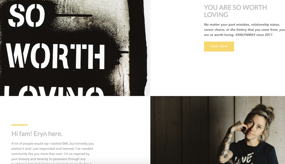
Sometimes, being evasive pays off. While it’s not always a good idea to hide your products from the viewer, it can be a very smart move if your product doesn’t make sense without understanding the backstory. With So Worth Loving’s site, you don’t even see the t-shirts for sale until a third of the way down the page. By that point, you’ve already read their slogan, a little bio from the founder, Eryn, and a full narrative about how the site began. The site leans into personal touches, with handwritten-looking quotes scrawled across images and very normal looking images of people posing in t-shirts. This is a great example of knowing your audience enough to break the rules.
12. Great George Watches
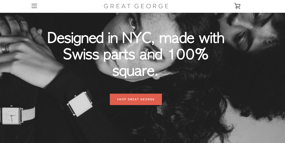
I’m not an experienced watch shopper, so when I first read, “Made with Swiss parts and 100% square,” on Great George Watches’ homepage, I thought maybe “square” was a fancy term I’d understand if I knew watches. But as I scrolled and read, “Think outside the circle,” I realized these terms were unique to Great George Watches, which are all square-faced. By emphasizing what makes their product unique before even showing the produce, Great George Watches captivates the viewer. I love this shop because it has a refined and polished look, with black-and-white photos and an attention-grabbing red call-to-action button.
13. Choose Muse
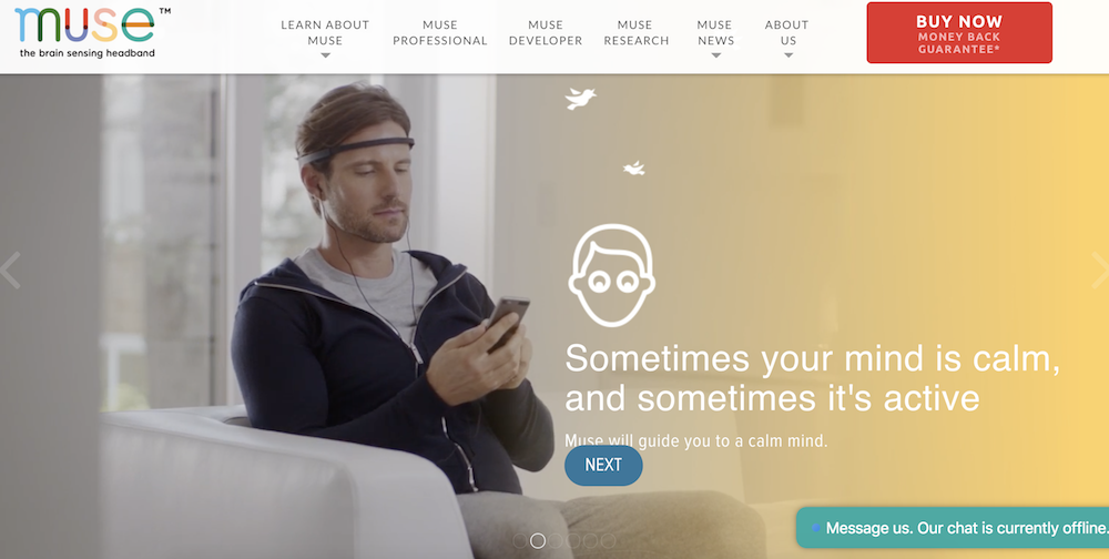
Choose Muse incorporates a full-display video of a man putting headphones on and using Choose Muse’s product right from the homepage. The video starts playing immediately (as opposed to offering a play button option), which is especially eye-catching. I usually think simple is better when it comes to design, but Choose Muse proves me wrong, incorporating compelling designs with a ton of images and text, while still retaining a clean and enjoyable viewer experience.
14. Brilliant
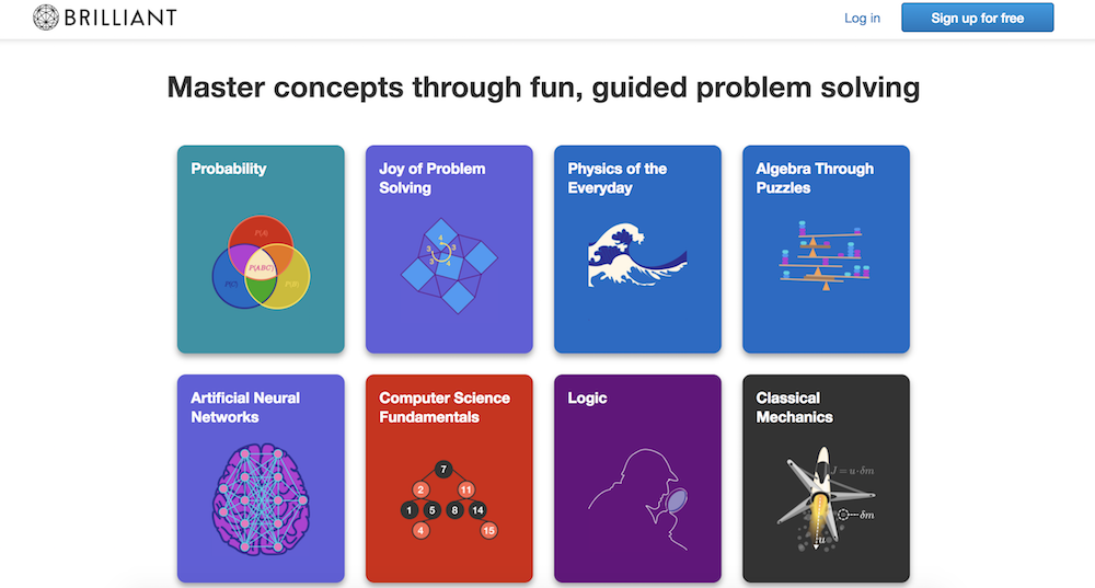
For a math and science website, Brilliant is surprisingly easy-to-navigate (even for someone like me, an English major … ), with big, colorful block buttons to choose the math concept you want to learn. This shop is also a fantastic example of using a call-to-action button wisely: there’s a big “sign up for free” button prominently displayed in the top right, and then another at the bottom of the page, after you’ve scrolled past the information you need. The site doesn’t have a navigation bar, but instead uses the web page to answer all the questions a viewer might have.
15. Holstee
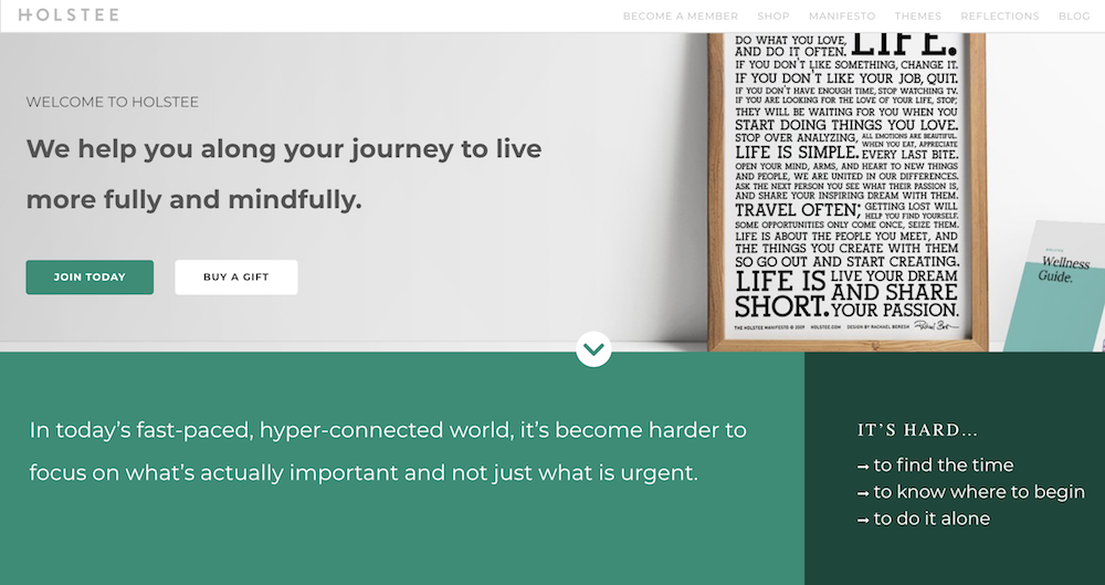
Holstee does a fantastic job of designing their site in tiers depending on a person’s initial level of interest in the product. For starters, you see the text, “We help you along your journey to live more fully and mindfully.” If you’re already convinced, you can click “Join today” right below the text. If not, you can continue to scroll down the homepage to find pain points this product reduces, read a “Holstee Manifesto,” see Membership benefits, check out testimonials, and find publications Holstee’s been featured in. Throughout the page, there are various calls-to-action, like “Choose a plan that’s right for you,” and then, at the end, “Become a member today.” I love this site because it becomes increasingly convincing and in-depth as you scroll: it’s clear they use their homepage as a start-to-finish marketing pitch.
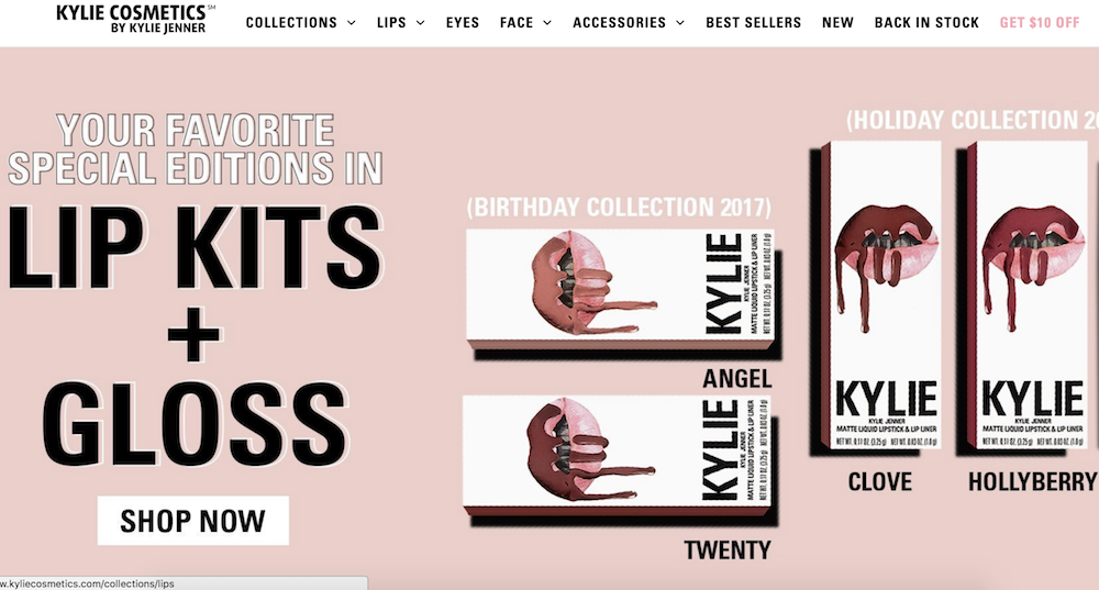
16. Kylie Cosmetics
As one of the top 10 most followed accounts on Instagram, Kylie Jenner’s Cosmetic brand is one of the bigger brands using Shopify today. Her site has a very distinct girly-girl vibe, with a bubble-gum pink background showing off her lip kits and gloss. Her site is well-organized for her audience: the lip kits, her best-known items, are shown first on the homepage, with “top sellers” below that. I didn’t feel overwhelmed looking through the various cosmetic products like I thought I would, and what really stood out to me about Kylie’s site is the fun, colorful layout. It might not be everyone’s cup of tea, but I’m betting it appeals to her target audience.
