Travel websites get redesigned all the time, but you just need to visit the homepage to tell that the team at Condé Nast Traveler has something different in mind. Instead of a standard river of articles, or a menu for navigating to different sections and travel destinations, there’s just a declaration in large text: “To all the rulebenders, wanderlusters, and amrchair travelers.”
Scroll down a bit and you’ll start seeing links to some of the most noteworthy content, including a list of the best hotels in the world, and several different city guides, but it’s spaced out much more luxuriously than a normal front page, and with cheekier headlines: “Don’t worry, it’s a grid” (New York City), “Look right, not left” (London) and so on.
Of course, many readers won’t visit the front page at all. Instead, they’ll end up visiting individual guides and pages via search, social media or newsletter. Still, Editor in Chief Pilar Guzmán said that the front page is “an opportunity for us to very clearly say who we are.”
And in this case, she’s hoping make it clear that Condé Nast Traveler has “a very specific point of view”: “There’s nothing generic about this content.”
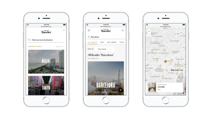
It’s not just the home page that’s changing. The site is now divided into three broad sections: The Bests, The Places and The Intel. Eric Gillin, the digital general manager for Condé Nast Traveler (as well as Architectural Digest and the company’s Food Innovation Group), said that those three sections represent “12 months of research” into the best way to organize all the content on the site.
Basically, the goal is to help you find the right content based on your stage of travel planning. If you’re still trying to get inspiration about where to go, then you can visit The Bests, where you’ll find articles about the best beaches and the most romantic adventures.
If you’ve narrowed it down to one destination, or maybe a handful of possibilities, you can check out The Places — that’s where you’ll find 20 new city guides. The guides are broken down into a total of nearly 5,000 “venue cards” that Gillin said were created “from scratch,” including pithy reviews in Q&A format. A hotel review, for example, might start by asking what the room was like; Guzmán said these are the kinds of questions you can only answer if you’ve actually been somewhere. Plus, the format allows her team to “break some bad travel-ese habits.”
Lastly, there’s The Intel, which is the newsiest section, with the latest tips and tricks.
Over time, Guzmán and Gillin said they’ll be adding more features for personalization and saving information.
And again, the theme through all of this is to resist creating more of the generic content that you can find in any other travel content. Guzmán said that she’s not trying to offers complete guides or definitive guides to any location. Instead, the goal is “this serendipitous, idiosyncratic mix of the hyperspecific and the utilitarian or inspirational.”
Featured Image: JW LTD/Getty Images


