Since 2014, Material Design has been Google’s design language for its apps. Now, the company is greatly expanding its services around its design system by offering a set of new tools around theming and working on design iterations, as well as new open-source components that developers con implement into their own apps. In addition to these, Google is also making Material Gallery, the same tool it uses to help its designers to collaborate on designs, available to everybody.
All of these new features are now available at the redesigned Material.io site.
Google isn’t making any major changed to the overall design language, but it is making it easier for developer to adapt Material Design to their own projects and two of today’s launched focus solely on this. The first is Material Theming, that is, the ability to make a small change to say the color or typography and have that applied across the theme.
“Theming lets anyone consistently and systematically express their unique style across a product,” the team explains. “When you make just a few decisions about color and typography, for example, it’s simple to apply the direction throughout the environment.”

Google itself is already using this system and notes that any company can now easily tweak the system its own brand guidelines.
Tweaking these designs still takes a good bit of work, so the second new feature — the Material Theme Editor — now make sit far easier to try out new designs. It gives developers a control panel that makes it easy to apply global style changes to color, typography and shape.
One nifty feature here is that the Editor will allow you to export your own Material theme based on your designs. Wile the tweaks that you can apply are still a bit limited, Google says that it’ll add more customization options over time.
Right now, the Editor only works with the popular Sketch design app and you can start using it by downloading the Material plugin for Sketch.

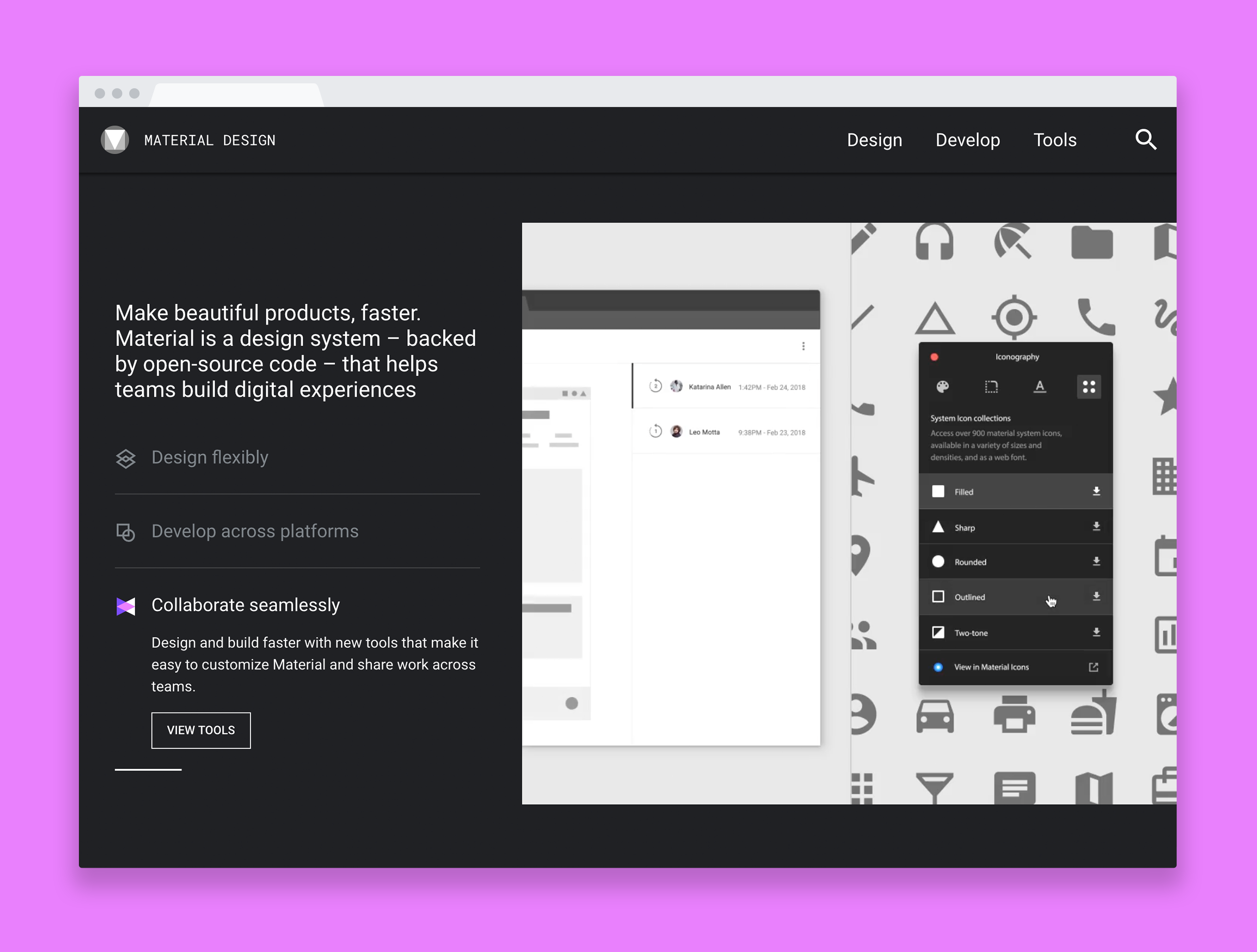
In addition to the work on theming components, Google also launched new Icon sets for Material Design today. These new icon themes can be customized as well and are available in baseline, round, two-tone, sharp and outlined variations.
And while theming is the highlight of this release, Google also today announced that it’s working on a number of new Material Components, that is, a set of pre-built design components. These will launch later this year.
The real highlight of the release may be Material Gallery, though. “Now anyone can use Material Gallery to review and comment on design iterations,” the Material Design team writes today. It’s the same tool that Google designers have used for years to collaborate on designs in-house, and now it’s out of beta and open to all.” The Gallery tool lets designers comment on their colleagues designs, no matter whether that’s an image or a video frame.
Google notes that the Gallery isn’t just for sharing and collaborating on designs but that it will also allow developers to take those designs and bring them into the Theme Editor.


