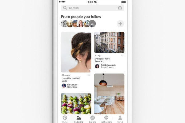
As Pinterest tries to double down on becoming as sticky as possible for users, it’s going to be making a pretty significant design change by adding a tab focused on who a user is following that will exist in addition to the basic discovery feed.
The tab will fall on the bottom of the app’s display, which means that as far as changes go, it’s going to be a sweeping one for users as it will be persistent across the experience. The typical Pinterest experience is geared around simplicity, showing users recommendations from the get-go based on a variety of tools built to divine what your interests are based on the content you peruse and the people you follow. Pinterest has billed itself as a visual discovery engine, but the addition of a button — and a new feed — throughout the app centered around following is a bit of a divergence away from solely focusing on algorithmic discovery.
It also comes at a time when there’s an increasing focus on algorithmic feeds on platforms like Instagram and Twitter. The new feed enables users to focus specifically on who they are following, which gives them a more narrow view of the content that’s available on Pinterest. But by doing that, Pinterest may indeed be able to capitalize on another mode of user behavior — the kind of intent-driven periodic check-in activity you might find on Instagram — that it could add to the list of behaviors it hopes to tap in order to get people to come to Pinterest.
That slice might fall between the more general clicking around behavior and actually searching for products, but filling each of those gaps is what is going to keep Pinterest engaging and its users interested in coming back. It’s also something that will help the app become more differentiated beyond apps like Instagram or Snap, all of which are pitching marketers that they’re able to find different parts of a user’s buying cycle to advertise against. Pinterest’s pitch, in particular, is that it can catch them at all parts of the cycle. Curating a feed is a very Instagram-y and Twitter-y behavior which is already thoroughly proved out, so it makes sense for Pinterest to see if it works in the context of showing products and ideas.
In addition to narrowing that feed, Pinterest’s rollout across its platforms comes at an interesting time as Facebook is finding itself under fire for a myriad of privacy issues. Pinterest — for the most part — seems to be relatively benign in its attempts to figure out the best content to show you. That’s partly because of the way Pinterest is built: it’s centered around products already (most of the content is from businesses) and designed to help you make a more informed decision on some life event, whether that’s what to wear tomorrow or what to do when planning a party.
It’s a change that might seem small, but it is indeed a sweeping one, and these design decisions are often not taken lightly. There are, for sure, elements of Pinterest that are pretty confusing. Looking at a pin someone sent you is around 3 or 4 screens deep in your notifications, and there’s always going to be room to collapse the number of taps it takes in order to smooth out the user experience. Pinterest said that push-and-pull in part came from people wanting both options of looking at just who they’re following, in addition to the general discovery feed.


