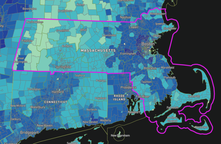
A big part of the FCC’s mandate is to ensure broadband is rolled out all over the country, and it issues regular reports along those lines — but there’s nothing presenting information visually to get the point across. A new official map of broadband access based on FCC data lets you browse block by block and see just what options are on offer, from gigabit fiber to DSL that would have been inadequate a decade ago.
The map is powered by Mapbox (which has its own blog post on the topic) and based on the forms (477, to be specific) submitted to the FCC by broadband providers. That means that this should probably be considered a bit of an optimistic view of what access is available where, and of course speeds achieved by subscribers may or may not be what is listed.
 An ISP might serve one or two buildings on a given block or all of them — info isn’t available at that level of granularity. Still, it’s much better than a census block level breakdown, which can show an area as served when entire communities within it aren’t.
The real data missing here is pricing; as the FCC and advocates have pointed out, it does someone no good to be “served” by gigabit internet if it costs $250 a month, more than many families can afford. What kind of service is available and for how much is something you’ll have to look into for yourself.


