Accessibility of digital content is something that hasn’t really been on my radar before. Like, at all. Didn’t even know it was a thing. I first heard about it when a client mentioned some corporate requirements related to accessibility for a new website they were building. Cue the lightbulb with the blinding flash of the obvious.
So in this article, I’ll walk you through the need-to-knows of accessibility… and hopefully spare you from a moment of awkward silence with your next client/colleague and a whole bunch of Googling.
What Does Accessibility Mean in the Context of Digital Marketing?
Approximately a billion people – 15% of the world’s population – live with some kind of disability. This includes roughly 285 million people who have visual impairments that affect their ability to interact with online content.
Many of these individuals use assistive devices when browsing the web including:
- Screen readers – tools that will read text out loud or convert to braille
- Magnifiers – tools that make text larger
- Navigation assistants – tools that provide alternative controls to mice (mouses? mice), such as joysticks, eye tracking technology, or “sip-and-puff” technology which allows people to control their computer by inhaling and exhaling (how cool is that?)
Marketers should take these kinds of impairments and assistive devices into consideration when designing websites, landing pages, email marketing content, and other digital assets.
I Really Don’t Need Another Thing to Worry About…. So Tell Me Why This Matters?
Accessible design isn’t about accommodating weird user quirks and preferences. It is about this population’s ability to access the entire internet, period.
Be aware that your clients (and their clients) likely include the 15% among us with disabilities. If you don’t take this stuff seriously, you’ll lose business.
And if that fact isn’t enough to sway you, the good news is that most of the best practice guidance for making your web content more accessible is… pretty much just best practice for making web content, period. If you take the time to review your content through an accessibility lens, you’ll likely improve your usability and SEO performance across the board.
8 Basic Ways to Make your Content More Accessible
A few things to keep in mind to make your digital marketing content more effective and accessible to all of your audience members:
1) Use Sufficient Color Contrast
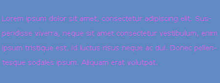
Use clear color contrast between text and background colors. This has an impact on many people with visual impairments, and it is especially important for people with color blindness.
So less of this, maybe:
WebAim has a great tool to measure your color contrast ratio and a wizard that will give you a quick pass/fail grade for accessibility.
2) Use Larger Font Sizes
A minimum font size of 14-16 pixels with 4 pixels for line height, is recommended for accessibility. And conveniently, that is also pretty representative of a large portion of the population’s preferences.
Yes, your subscribers can zoom in and out to make their text bigger. But do you really want that to mess with the perfect design and layout that you slaved over? If you design with accessibility in mind from the get-go, this is a non-issue.
3) Don’t Put Your Text in Images
If your audience is using a screen reader, that reader will not be able to decipher your PNG or JPG – it needs text on a screen. Your most important content should be presented in text, with images used to support the message you’re trying to convey.
4) Include Alt Text for Images
When you do use images, include descriptive alt text so that screen readers can pick this up and convey the graphical content to your subscribers.
5) Create Visual Hierarchy & Scannable Copy
Use headlines and subheads to make your text easy to scan and quickly find critical information. Use breaks between paragraphs and left aligned copy when possible, as justified text makes breaks in content harder to follow.
6) Include a Plain Text Version
Good news – this is an easy one! Pardot prompts you to create a plain text version of all emails out of the box, which is very helpful from an accessibility perspective. This provides another opportunity to check that all of your need-to-know info is included in a format that assistive devices can access.
7) Make Links Easy to Tap
Avoid bunching your links really close together, and consider using bulletproof buttons to make your links easier to click with less precision. This helps users who may be navigating your content with a device other than a mouse, including mobile users just trying to hit the right link with their index finger.
8) Put Down the Party Parrot
Party Parrot in Slack is one of my favorite emojis. (If you don’t know what I’m talking about, Google it. It’s enthralling.) But no more – at least not for email marketing.
Bright, strobing media can cause dangerous or life-threatening seizures. Do you really want your “flash sale” email blast to be responsible for that? Images that could potentially cause seizures are those that:
- Flash more than 3 times per second
- Are sufficiently large
- Are bright, with high contrast between the flashes
Legal Stuff: What Happens if Your Content is NOT Accessible
The main international standards organization that sets guidelines for accessibility is the Web Accessibility Initiative (WAI) of the World Wide Web Consortium (W3C). They have published a set of Web Content Accessibility Guidelines (WCAG) that specifies how to make content accessible.
Legal stuff makes my eyeballs glaze over. Pretty sure it’s a medical condition. There are three acronyms in that last paragraph… and I’m about to drop a few more.
The current version of this W3C’s standards is dubbed WCAG 2.0, and it also became an ISO standard in 2012. The are 61 checkpoints that map to 3 levels of accessibility. Yes, you heard that right — 61. But they’re not all created equal. Here are the 3 “buckets” that group these in terms of importance:
- A – the “must” list. Without meeting this criteria, at least one group of our your potential customers will find it impossible to access information.
- AA – the “should” list. Without hitting these points, one or more groups will find it pretty darn difficult to enjoy the fruits of your marketing labor. Satisfying this checkpoint will remove significant barriers to those with disabilities.
- AAA – this is the “may want to” address list. Without meeting these criteria, one or more groups will find it tricky, but not impossible, to get your info.
Regulations may vary depending on the countries where you do business – so be sure to take a gander at local laws.
Here in the U.S. of A, the U.S. Architectural and Transportation Barriers Compliance Board (aka the government agency you’ve never heard of but is the official “Access Board”) added a rule that requires federal agencies to keep up with at least WCAG 2.0 AA by January 18, 2018.
This also applies to businesses that sell to or receive funds from federal agencies – so many educational organizations, non-profits, and NGOs may also be required to comply with these standards.
Legal precedent related to web accessibility is still emerging. But the prevailing opinion is that Title III of the Americans with Disabilities Act may come into play here, and this pertains to private sector businesses – so regardless of industry, we may all need to play catch up here pretty quick.
As web and mobile applications continue to become more necessary components in our day-to-day lives, marketers should expect this issue to continue to grow in importance.
Next Steps to Making Your Marketing Content More Accessible
Is this something your organization is working on? What other best practices would you suggest? What else should we be thinking about when designing effective email and landing page content that all of our subscribers can read?
Share your thoughts in the comments!


