While many are on the lookout for new, big revamp of Gmail, its smaller competitor Yahoo Mail today jumped in first with its own set of updates, covering both new personalisation features and faster performance times.
The changes come about 10 months after Yahoo Mail rolled out its own major redesign, and are an extension of some of the themes that the company introduced back then. Change and iteration is the theme of the day, it seems: today, Yahoo Mail’s parent Oath (which is also TechCrunch’s owner), also announced a new president and COO, K. Guru Gowrappan, who joins from Alibaba and had in his distant past once also worked at Yahoo, as well as Quixey and Zynga…. (Additionally, Oath’s former senior director of publisher products, Simon Khalaf, has also parted ways with the company.)
Yahoo Mail has a long road ahead of it to grow its user base: the service suffered one of the biggest user data breaches in the history of the internet, affecting more than 1 billion people and impacting the price that Verizon ultimately paid by some $350 million when it acquired Yahoo last year. That, plus the general march of time, the lack of updates Yahoo Mail made over many years previously, and the swift rise of Google’s Gmail, have all served to keep the company’s growth in check. I asked for an update on active monthly users but have yet to get it, but last year the company said it had 225 million active users. As a point of comparison, Gmail today has well over 1 billion (based on a figure Google confirmed back in 2016).
Still you can say that Yahoo has been thinking ahead of the curve in some respects: last year, the company introduced a Pro version that you pay for in exchange for no advertising. Given the wave of criticism that is now hitting Facebook — and by extension all ad-based “free” services — over just what kind of information is being gathered, bartered and used relating to us, it will be interesting to see how much more the idea of paid services in lieu of ad-based free catches on.
In any case, today Yahoo Mail’s focus is on improvements to the performance of the whole Mail product. The company continues to iterate on the new Redux architecture that the company introduced when it announced its rebuild last year. Among the changes that are now in place, Yahoo says that there is now a 50 percent reduction in JavaScript exceptions; and a 20 percent reduction in overall API failures, including 20 percent when checking for new emails, 30 percent when reading email messages, and 20 percent when sending emails. Page load performance is up by 10 percent, and frame rendering by 40 percent — speeds that may not really be actively noticed by users, but will inevitably make using Yahoo Mail that much smoother.
In terms of new features, there are several areas where Yahoo Mail is adding more bells and whistles that focus on personalisation.
Yahoo Mail said that photo themes — the ability to add new backgrounds behind the actual interface of the otherwise relatively-vanilla mail service — have been one of the most consistently-requested features for the product. So building on the previous ability to change the color, now you can also add photos (illustrated above). Given the existence of Flickr in the Yahoo stable, and the way that Yahoo has been using imagery in other products like its Weather app, I’m surprised that it’s taken this long to get this one off the ground.
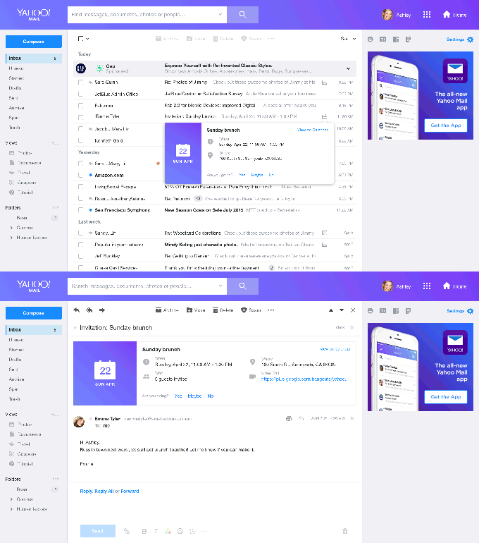
Another new feature is tighter and better integration with your calendar. Specifically, now Yahoo Mail will let users create and send calendar invites directly from within the mail service. This will also mean that users can now short-cut by accepting invites (or rejecting) without even opening the mail itself. Users of Gmail may know this feature well, and again it’s a welcome and needed addition to the Yahoo web mail service.

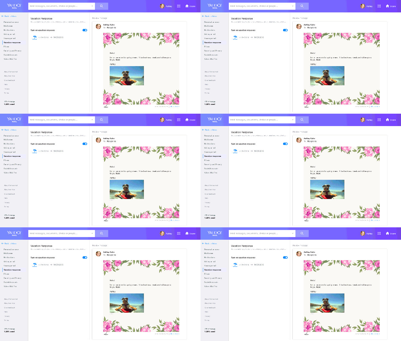
Finally, Yahoo Mail is adding some more pizzaz to your out of office responders. I can’t help but think of TV shows like The Office, which parody the boring monotony of working in offices, when I hear about improvements like these: features that make very mundane things — like OOO responders — more “fun”. Still! Having been the recipient of many a “zany” OOO note, I know that people do love to play around with these, so here’s to the crazy ones. You can now add GIFs and custom stationery to let your autoreplies stand out a little bit more.


